5 things I learnt when improving LiveDataset ergonomics.
A client explained that their workers’ council needed improved usability for LiveDataset to pass their stringent accessibility and ergonomic requirements. This gave us a much-needed nudge to improve accessibility. As this is something we value, we realised it was time to step up to the challenge and solve the issues in addition to the more day-to-day problems that we usually deal with for clients.
Our first attempt involved doing a few styling changes to improve contrast and making some dropdown menus more keyboard navigable, reacting to superficial requirements. While the effects were a subtle visual improvement, some early feedback from clients made it clear that there was much more to do.
With the extra feedback we realised that, unfortunately, it wasn’t a simple case of tweaking some style sheets to generate the right outcome. We needed a complete review of the user experience to make the necessary changes and to ensure consistency. For me, personally, this meant diving into parts of LiveDataset that I hadn’t visited for a while and questioning the value of every link, button, and dropdown.
Fortunately, to help us continuously improve the product, we had been collecting detailed anonymous analytics along the way. This data proved invaluable as we analysed exactly how people interact with almost every feature and understood their actual value for users.
The learning, I found, went beyond just looking at analytics and these are some of the insights I gained that stayed with me.
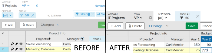
1 Consistency Matters
Consistency improves usability, but it also improves the overall feel by making it feel more professional. Patterns emerge, and these can be re-used, which means the development team don’t have to re-invent their approach every time a feature requires, for example:
- We now only use two shades of blue and one shade of grey – not three or four.
- We now only use two font sizes.
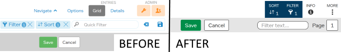
2 Think Simple First
Thinking about keyboard navigation on the web encouraged us to keep interactions simple by separating out calls to action clearly so that each link, button or dropdown menu item can be easily accessed.
We are encouraged to think mobile first when designing responsive websites because the smaller touch screen means the display and interaction needs to be simpler. Similarly, thinking keyboard navigation first encourages us to focus on what is really needed and to make it clear. For example
- We now use fewer controls above the grid and they are simpler
- The less-frequently used items are now tucked away on the “MORE” menu
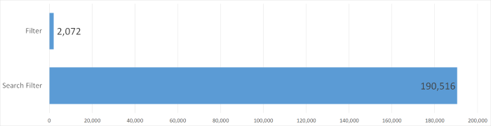
3 Analytics Help Make Informed Decisions
Usage analytics help make data-driven decisions, particularly when trying to get rid of underused features. This helps overcome individuals’ cognitive biases.
It meant too that if, for example, there were two different routes to access the same feature and one was clearly favoured over the other, the least used could be considered for removal and that would be one less bit of UI to maintain.
For example, in our own use of LiveDataset we typically used filters on a specific column, as this is precise explicit way to focus on entries matching your criteria. But we are not typical users. The data showed clearly that 99% of the time people used search – as a quicker, easier way to find the entries they were looking for. So, using search for filtering is now more prominent.
4 Accessibility Means Everyone Wins
We found that using colour contrast effectively not only improves usability, it also makes things look better. This is a graphic design principle I learnt some time ago, but it’s good to reinforce these principles through practice and be reminded about them occasionally.
Improving the keyboard navigation made the user interface clearer. I doubt that anyone would complain about clarity whatever their ability level.
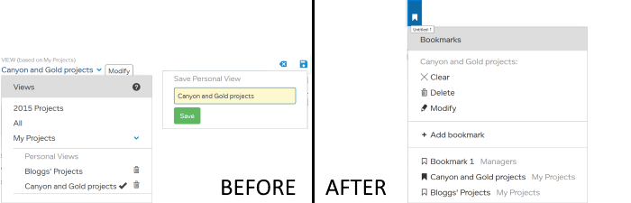
For example, the user interface for bookmarks used to be in two parts. There were two small icons on the right for saving/clearing and a separate sub-menu within the views menu for selecting/modify bookmarks with icons on the right. We have simplified this to one menu, where the user can press the down key to select the next option and press Escape to cancel at any time. This particularly helps people with limited visual or mobility abilities and makes it easier for everyone to use.
5 Use Accepted Wisdom
Unless you are creating a revolutionary UI and pushing the boundaries, it is best to stick to the accepted wisdom gathered from many years of interaction research. The information is out there if you choose to use it.
Baking in some solid accessibility and design principles is more effective than retrospectively applying changes. Of course, hindsight is always a wonderful thing!
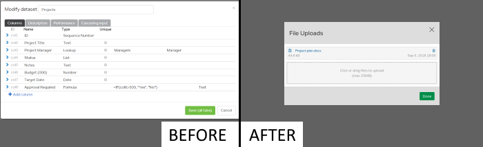
For example, we used to use modals for data entry forms and for configuration. Below is an example of a modal for modifying a dataset with multiple tabs, lots of fields to expand, many detailed checkboxes – lots of scrolling was needed and it felt awkward to use. The accepted wisdom is that modals should only be used for short, simple dialogs. So, we now only use modals sparingly, e.g. for uploading files.
Feedback
Finally, we care what you think.
Any feedback about LiveDataset usability is greatly appreciated. Big, small, annoyances or praise – we love it all. Please send to info@livedataset.com